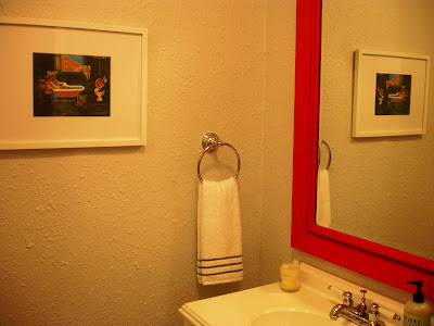
For the bathroom, the end result was blue walls, a bright yellow shower curtain, and a DIY red mirror. Not exactly the welcoming, peaceful experience that a guest bath should create.
So I started with an easy update to make any room brighter: paint. I went with Benjamin Moore’s Paper White. It is an off-white with just a slight hint of blue (actually very similar to Horizon, which I repainted our living room, kitchen & hallway – but less gray)
{painting progress}
Up next was to remove the gigantic towel bar beside the sink. I have a feeling that no guest of our’s will really need a 4-tiered towel rack, no matter how long they stay. And we also sent off the wobbly glass shelf above the toilet. I’ve seen bathrooms that these look great in, but our’s was just a junk collector.
I replaced all the hardware with a matching polished nickle set from Lowe’s, and Jeff even replaced the electrical outlets and light switch with fresh plates (who puts in black outlets anyway? what an eyesore!)
{before & after}
We also added a bright white shower curtain, to keep the room feeling as open and bright as possible. I had it monogrammed in dark gray (interesting fact: the woman at the shop told me that it used to be that the man’s initial always went first, but now people don’t keep to that as much… So we put the J first, because otherwise we would’ve had a huge space between the C and W – then almost no space between the W and J. Sorry Emily Post, aesthetics trump tradition this time)
{before}
{after}
I also ordered my new favorite rug from Garnet Hill (also have one in our kitchen now) in gray...
...and this cute print from Etsy. I framed the ‘Keep Calm & Soak On’ print along with one of my favorites that Jeff’s grandpa painted in matching Target frames.
I’m so happy that we decided to spruce up the guest bath some. Not a major overhaul, but enough to make it feel brighter and more guest-friendly!
{before & after}
Psst... Apologies for the many weird camera angles. As you can tell from the picture of the rug/floor, this room is small! And the tight space meant not so great overall pictures.


That came out really nice! The white really opens it up. Good job :)
ReplyDeleteLooks good, I really like the shower curtain, it makes a big difference!
ReplyDelete